Close-up of empty red velvet cinema seats in a dark auditorium, numbered seat two in front

Cinema Seat Plan

Working the box office, I kept watching customers hesitate over open seats that looked taken: an independent redesign of the colour system behind a cinema's seat selection.

UX Design 2025

01 Problem

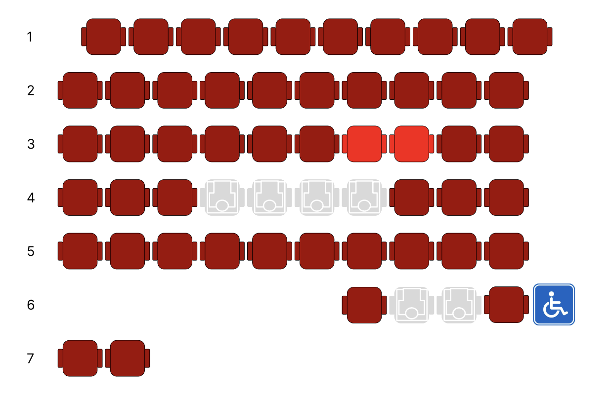
  • Available seats are displayed in red
  • Red is commonly associated with unavailable or occupied
  • Users hesitate or assume seats are already taken
  • Staff frequently need to explain the interface
  • Light red seats are the selected ones, that the employee select for the customer. However, these are not directly recognised by the customer.

→ Frustration among the employees because it is obvious to them. Confusion and incomprehension among visitors. The sales process generally takes longer than needed.

02 Analysis

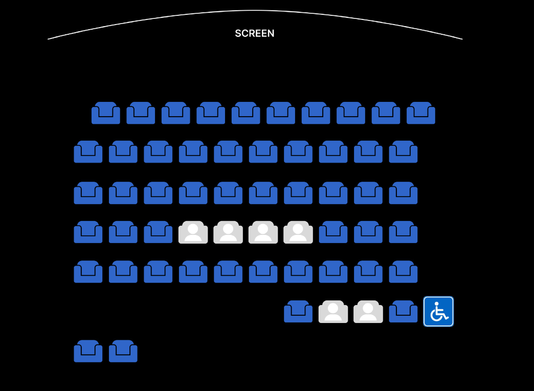
The Online Userinterface does not cause a lot of booking problems. But the link to the seat selection in the cinema is not visible because the appearance is different. In the UI design in Europe, red is often perceived as a request/warning or as a no in the case of busy. This is causing here a mismatch between interface and user expectations and does not fit the common booking conventions.

Diagram of the five-step sales process at the counter, with a callout showing where the customer fails to understand the code for free and sold seats
The cinema's existing online booking interface: a seat plan in blue, with taken seats marked by a plain grey icon and an accessible seat marked by a wheelchair symbol
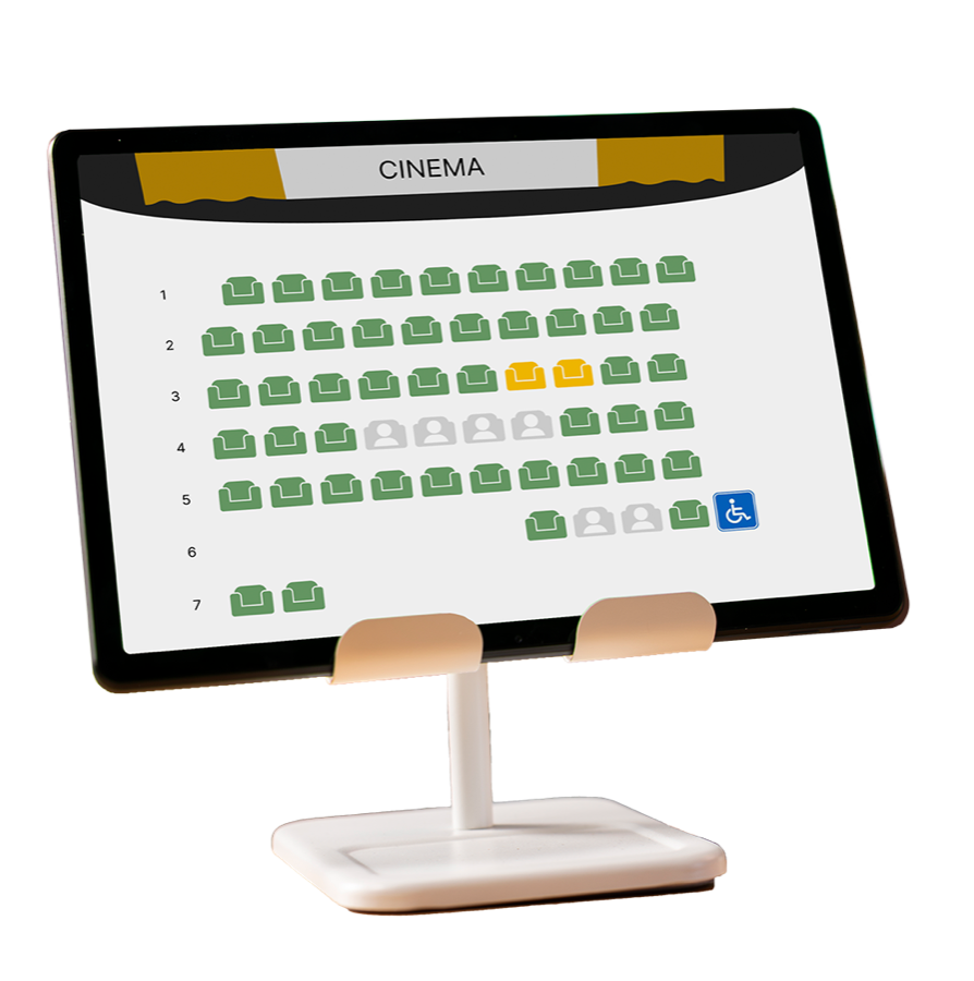
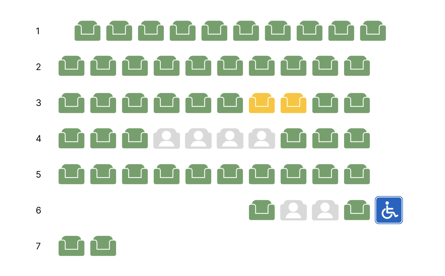
The redesigned seat plan on a cinema counter tablet: available seats in green, two selected seats in yellow, taken seats greyed out, and an accessible seat marked with a wheelchair symbol The redesigned seat plan on its own: available seats in green, two selected seats in yellow, taken seats shown as grey icons, and an accessible seat marked with a wheelchair symbol Colour palette from the cinema's entrance and café: sage green, near-black, dark olive-brown, slate grey, and a warm yellow accent

03 Redesign Concept

As the shape of the seats cannot be changed due to the existing booking system, I limited myself to the choice of colour for the design. The main reason for this was to keep the costs as low as possible while maximising the benefits. Also the Icon on the seats got changed, to make the whole impression more clean.

Colour Scheme of the Cinema, also in the online booking system. To make the interface inclusive for people with red-green weaknesses, yellow is used as a contrasting colour.

In addition, the contrast has been increased, instead of red and light red. And now the psychological colour selection is also correct: green means free.